On the last Tuesday of every month I attend the Oklahoma City Colored Pencil Society of America meeting. We meet at the Hobby Lobby in Mid West City. You can find more about the meeting place and times at the OKC CSPA website.Â
Last week we had on the agenda a demonstration by J.R. Daniels on color pencil technique, and a presentation by club president David McBride on how to resize your art work for online submission.
J.R. set up his pencils and began drawing a beautiful dragon’s head. He showed us a few tips and tricks on color selection and mixing, layering and blending. He spent most of the meeting working on this even through David’s presentation. The presentation on preparing your work digitally for online submission had some pretty good tips. David geared the show toward the technologically challenged, so it was a little on the thin side for me. But he did demonstrate some things in MS Paint that I had not previously known you could do. When I began messing with paint programs I found Paint Shop Pro and never looked back. So when David got the the PSP portion of the program, I was really keen to see what he knew that I didn’t. ;) Mr. McBride demonstrated with his own artwork how to resize it in a manner that would preserve the sharpness of the image. He went on to demonstrate how to create new works entirely digitally. David put on a sharp and interesting presentation and a good time was had that night. I don’t have any pics of J.R.’s dragon, but David took quite a few. He will post them the to OKCCPSA website if he ever gets a break from school, family and his day job. Good luck with that, David. I know it’s been a constant struggle for me.
I am posting tonight from a borrowed laptop as I am 500 miles from home on a business trip. I wasn’t cool enough to scan in any pics or bring any thing with me colored pencil wise that was ready to be exposed to the world, so I thought I’d leave you with a drawing I did from a lesson at drawsketch.about.com.
On Tuesdays, I like to post the weekly challenges I am involved with, or any new challenges I might find. The Illustration Friday challenge this week is “Adapt.” Of course with my background in biology, I immediately thought of evolution. After brainstorming a bit I came down to cro-magnon in a business suit, or a chameleon in the unemployment line. I also thought of my friend Nick Dupree and the ADAPT organization. I decided there was enough depression about the economy and ran with the cave man. I borrowed a business suit from the Hanna Barbara line and viola! Adapt – A self Portrait.
weekly drawing challenge at wet canvas. China marker on Canson recycled paper 9" x 12".
I went to the Oklahoma City chapter of the Colored Pencil Society of America meeting last week. One of the guys there was giving a demo of blending and color choices. He drew a beautiful dragon head from imagination. I’ll talk more about that tomorrow, but I have always loved doing dinosaurs and dragons. However, my dragon heads always end up looking like beaked muppets. I was trying to decide what I needed to fix that. Just today on the ride home from work, I decided that I needed to draw more animals. I watched the special feature footage of how they did the dragons on Reign of Fire. Turns out they based much of their dragonry on cats, especially their movement. That’s what I was thinking about when I came across this week’s drawing challenge over at Wet Canvas.   That’s kind of like the universe saying, “Hey Blade, draw THIS!”
On Friday, Jeff Knecht and I had a critique session in which he mentioned that the trees on the left of this sketch were difficult to distinguish. He thought they were one tree and thought that the details were a bit jumbled. My lovely young bride and I had been talking about that very thing just that morning and I asked her for some pointers. She suggested that I try to distinguish the colors more and that I incorporate a bit more atmospheric perspective. I asked her if she would be willing to write out a lesson for me to post here. Alas, it was the last week of school for my art teaching lover, and she was too busy with clearing her room for summer.
I did find a cool tutorial online that I thought I would share with you, along with my step by step version. Kristen Godsey wrote has an article that is hosted at The Artistic Network called Getting Greenery Right. She suggested that I should wash my foreground color first. After that dries, paint in my background tree. Once the background tree dries, then I should lift the background paint off of my foreground image. HUH? Not to worry. It’s not as complicated as it seems. In her demonstration, she is lifting blades of grass to create a lighter foreground. She uses a very stiff brush and a full pallet of transparent and opaque paints. I use a waterbrush and a set of transparent pans. Let’s see if I can modify this technique to work for me.
washing the foreground color
First, I use a warm green for the leaves of the cottonwood tree in the foreground. This is strictly from memory, so you’ll just have to believe me when I tell you it is a cottonwood. Anyway, I apply a wash in the full overall shape of the cottonwood tree. Then I went to play on Twitter while I waited for the paint to dry. I know that it was not very zen of me, I should have been of one mind and all that. But seriously, waiting for paint to dry is not one of my strong suits.
Painting in the background tree OVER the foreground wash
Next, I use a cooler and darker green for the cypress tree in the background. This is kind of the confusing part for me because usually if you want something to stand out in the foreground you make it darker. But this type of tree actually is darker. You can tell, I am easily confused. Anyway, that’s the point of using the cooler color to give it a little push to the background. That’s where the atmospheric perspective comes in to play. Less detail and more subdued colors move an item to the back or off to the side out of focus. If I had wanted this in the foreground, I would have used bolder colors but still less detail so that the focus would have remained on the cottonwood, and subsequently the chapel (remember the chapel?).
"Lifting" the foreground
“Lifting” the foreground is especially simple with a waterbrush. The constant supply of fresh water easily lifts the pigment off the paper. The only thing I had to be careful of was lifting off the foreground color as well. Also, just like with a regular brush, after you pick some paint up, you have to remove it from your brush or you just keep redistributing it. So unless you want to lay that same color back down on your painting, best to wipe your brush off after every lifting stroke.
Re-apply warmer foreground
Almost finished now. I have reapplied the foreground color. I’ve added a little more heat to it (a little red and a little sienna) and brushed it around the whole of the area of the cottonwood. Also, I’ve used it to define some of the shading on the tree.  It has already made a distinction and now I’m excited to see how it’s going to turn out. I’m off to play on Twitter while the paint dries again.
details
Finally, I went back in and added the tree trunks, branches, highlights on the leaves, etc. This time, I think it’s quite obvious that they are two different trees.
I’m eager now for a chance to try this in the field. It is supposed to be beautiful weather all week so I may ride down to a creek by my day job and try this out on location.
I hope I can twitter from my phone while the paint dries, though.
It is time once again, the last week of every month, for the Virtual Sketch Date! At the VSD, they post a photo reference every month and you are supposed to give your rendition of it. It is open to any artist in, I believe, any medium. You are given one week after the photo is posted to put up your version. The only sort-of rule is that the first image needs to be related to the reference photo. That is, draw/paint/sculpt this image before you begin your abstract fantasy sci fi masterpiece. I did mine while watching the Teenage Mutant Ninja Turtles with Girl2. With all the jumping around and Mutant Ninja action, we had a mishap that included Girl2’s foot, my elbow and a PITT pen. For the record, you can’t really scrape cheap paper.
On that, I met with my printer yesterday and the new sketchbooks will be ready by next Friday. It really took some doing deciding what paper, binding and even the cover cardstock I wanted to use. But we finally agreed and the first set will be rolling off the presses Friday! If you would like one, I’m sending out a few to my artistic friends so that I can get some feedback before I end up with 1000 of these in my garage.
E-mail me with your mailing address and, if you’re one of the first 25, I’ll send you one!
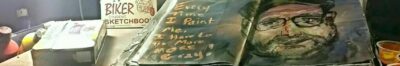
The Artistic Biker Fine Art Sketchbook. Smooth watercolor paper (U.S. domestic), 50% cotton, 50% synthetic. 4" x 6" perforated pages. Made in the U.S.A.
I like to do critiques here every Friday to share my learning experiences with you. I learn as much from giving the critiques as I do from getting them. I hope that you learn something as well.
Jeff Knecht of Jeff’s Blog and I have led parallel lives in that we both gave up the pursuit of art for the pursuit of career and family. Both of us even ride bikes except that I ride the motorized kind because if I rode the pedal kind like his, I would collapse in a heap at the side of the road gasping for air like a goldfish on the counter top. Both of us have found our way back into the art world via the Everyday Matters group on Yahoo. A few weeks ago, I asked Jeff if he would be interested in an online critique session and he replied with a resounding YES! We had such a good time doing that, and it was such a success, that we decided to do it again. So, without further ado, I give you this week’s Friday Critique with our very special guest Jeff Knecht! Blade21292: Woot! Man, that was a fast two weeks! Blade21292: How’ve you been?
Jeff_Knecht: not as productive as I would have liked
Blade21292: You and me both, buddy. I had HUGE plans for this past week and this three day weekend. NADA!
Jeff_Knecht: been spending my time working on some digital photography and a little bit (ok, a lot) of programming
Blade21292: Now see, that’s creative to. For work or pleasure?
Jeff_Knecht: pleasure…Â it was a hobby that turned into a career, and then stayed a hobby too Jeff_Knecht: the fact that I get paid to do what I love is a just a giant joke to me Jeff_Knecht: I’d be doing it for free anyway ;)
Blade21292: That’s how I felt when I was in sales. Meet someone new, take ’em to lunch and maybe golf… checks are direct deposit. ;) Blade21292: What have you been programming?
Jeff_Knecht: just working on a reminder system for myself Jeff_Knecht: I’m not happy with what any other program I’ve used will do for me, so why not make something customized to my own needs Jeff_Knecht: plus I’ve been wanting to try out some ideas with respect to user interfaces… this is a decent vehicle for that Jeff_Knecht: anyway, it’s a huge time-suck. 6 hours can just disappear
Blade21292: That’s right, my friend, it’s all about what works for you. I keep a hot glue gun handy at home and work just because I am constantly customizing something. Beyond HTML though, I’ve never really dipped into programming. Blade21292: And yeah, I know all about the time suck
Jeff_Knecht: I just got done reading your post about mowing the lawn…Â good stuff
Blade21292: I have been in trouble all weekend for not doing the yard work and such and I really did just now finish mowing it.
Jeff_Knecht: it’s nice to have a hobby that helps justify procrastination :D
Blade21292: Thank you very much, btw. Blade21292: If my hobby were model trains, I doubt I would get as much support from my ART TEACHER wife. ;)
Jeff_Knecht: but mostly, I loved the gesture drawing of the mower…Â great feeling of movement in that little sketch
Blade21292: I love doing those quick little sketches like that. Like a chinese ink brush or zen drawing. I love the way they look and I love trying to do them Blade21292: I’ve got a little giraffe that I did at the zoo today in that style
Jeff_Knecht: I saw one you posted a while back – a zebra and giraffe… wonderful little guys Jeff_Knecht: They reminded me of the animal sketches picasso did, where he tried to capture the essence of the animal in as few lines as possible Jeff_Knecht: you should do more. those are some of my favs that you’ve posted
Blade21292: Yeah, but picasso could really draw too. I have to get there before I can pass off the stylized work. Blade21292: Just like the first time I heard the guys from Metallica on acoustic instruments, I was astounded when I saw the realism works of picasso and warhol etc.
Jeff_Knecht: Ha ha… you sound like me Jeff_Knecht: If nothing else, when you hear/see an artist do something that you normally attribute to “classical” artists, it helps you really appreciate that their style is a choice and not just the only way they knew how to do it Jeff_Knecht: Either way, they elicited a response in me…
Blade21292: The biggest advantage of those drawings are that you can capture a lot quickly. I desperately need to get faster at people and animals and this is a really fun way to do it. I use a brush pen that I learned about from Russ Stutler at http://sketching.cc Blade21292: So, carbon pencils eh?
Jeff_Knecht: yeah… carbon pencils… Jeff_Knecht: I was having a hard time getting darks that I was happy with. These babies are (almost) black as night
Blade21292: how do yo handle gray tones with ’em?
Jeff_Knecht: but as far as the grays… I didn’t use the carbon pencils for most of the grays. only the dark stuff
Blade21292: Have you tried them for the midtones?
Jeff_Knecht: if I were to use them for midtones, I’d have to create a Jeff_Knecht: “carbon farm” and then use a tortillon to pick up the color and move it in very carefully Jeff_Knecht: carbon doesn’t really erase, so if you go too dark, you’re stuck
Blade21292: That’s the problem for me with brush and ink is getting midtones. Can you not pick it up with a kneaded eraser? I’ve never tried these, as you can probably tell.
Jeff_Knecht: no – the kneaded eraser is just about useless Jeff_Knecht: The nice thing is that the carbon and the pencil blend pretty well together
Blade21292: At least with ink, you can water it down Blade21292: I will have to try this!
Jeff_Knecht: six bucks for a 4-pack: B, 2B, 4B, 6B
Blade21292: You know, when I get to go to figure drawing group I have been using china markers. Same thing, if you’re wrong or want mid tones, well that’s just too bad.
Jeff_Knecht: That kind of drawing suits me pretty well – I rarely erase anyway (I attribute this to inertia — I just don’t want to stop, put down the pencil, pick up the eraser, clear the bad line, start again) Jeff_Knecht: If I erase at all, it is usually at the beginning of a drawing, where I can just delete the whole thing and start again
Blade21292: I read that on your blog. That’s one of the reasons I decided to do it that way. Blade21292: LOL delete it! It’s easy to tell where your mind has been.
Jeff_Knecht: something about flying without a net, though, gives me a little rush Jeff_Knecht: lol. woops… when worlds collide, huh?
Blade21292: Happens all the time around here too. Blade21292: So, do you have anything in particular you want to look at this week? Blade21292: I’d go for the candle, but you’ve already critiqued it pretty well
Jeff_Knecht: there’s even less to choose from than last time. But I’m actually pretty happy with the charcoal sketch of the harbor (though, it’s probably a bit TOO gestural to do a decent critique) and the candle. Jeff_Knecht: You?
Blade21292: I like the chapel and the bell
Candle on Rocks
Blade21292: For the candle, I think you pretty much nailed it in your self critique. I love the detail of the stones and the contrasts in the glass bottom. You’ve really used the darks to bring out the depth of this drawing and give it some dimensional attitude. The carbon pencils seem to work will for you here. You are right when you say that your elipses are off a little. Also, on the shading technique, in some places it’s blended well and in others it’s more of a hatching. The hatching works to provide texture for the river stones. It contradicts with the texture at the bottom of the glass though. The top is smooth because of the blending, so what texture is at the bottom? The distortion of the candle through the rounded glass is great! Was that on purpose? ;) Also, did the wick not come through under the curvature? I really like these close cropped still lifes and I can go on and on about them. I’ll stop here except to say that this a good example of composition and contrast. I think we ALL need to work on our elipses.
Jeff_Knecht: Ha! Thanks for pointing that out… I adn’t realized that I had cross-hatch the sand and not blended it properly. Now that I look at it again, it really stands out Jeff_Knecht: and yeah, the ellipse… I don’t know what happened there. All was OK with the top of the vase until I went in with the blending stump, and I managed to hose it all up. Jeff_Knecht: By the way, some of the crosshatching on the rocks was not on purpose… as well as the carbon pencil blends, I couldn’t get these to smooth out properly in some cases. In other cases, I was hesitant to blend too much for fear of causing them to go too dark. Just something to keep in mind when you try them yourself
Blade21292: Well, the hatching on the rocks works with the blending to give them that smooth striped appearance that river rocks often have.
For Blade’s critique on The Harbor, visit Jeff’s Blog
EDM 122: Draw A Bell
Jeff_Knecht: with respect to the bell, I think you’ve captured the shape exceptionally well — one look, and this is instantly recognizable. The reflectivity of the bell is lost in some fairly soft transitions between light and dark. Reflective objects have almost no transition between light and dark, and the contrast is usually pretty stark, so I would push the darks a little more and leave more whites. I don’t get a sense of different materials between the bell and the ribbon (?) that is leading off to the left side. Again, more contrast in the reflective surafaces would help distinguish. Also, I know you don’t typically blend with a stump/tortillon, but you might consider using one in one texture and not the other to help differentiate. The bell “turns” pretty well — you did a good job of presenting a 3-dimensional object.
Blade21292: I have always shied away from drawing shiny things because they intimidate me. My style has always been to capture the essence of the podlings and then flesh it out later at my leisure. I haven’t been able to do that with shiny things because the contrasting reflections are what make them appear shiny. The journey is what it’s all about though, so I’m stepping out of my comfort zone and drawing more and more reflective surfaces.
Jeff_Knecht: I hear ya. Shiny things are really hard to get right, because not only do you have to draw the thing itself, but you have to capture all the things it reflects Jeff_Knecht: But one thing I like about reflective surfaces is that that it forces you to really LOOK at what you’re drawing. You can’t just draw what you think a glass, ball, bell, or whatever looks like — most of the time, you’re not dawing the ball at all; you’re drawing the stuff reflected by the ball. And since that stuff is distorted in a very particular way, you are forced to concentrate on what you SEE — not what you THINK you see.
Blade21292: Exactly, I have a student now that I just took through the lesson of drawing what’s really there.
For Jeff’s critique of the chapel, visit Jeff’s Blog
At this point, I accidentally closed the window of chat. Jeff still had his open but basically all that was not already here was he and I saying our goodbyes and agreeing to meet again in a couple of weeks. I can’t stress enough how great it is to get to work with Jeff. I learn so much from his critiques and he is just an all around interesting guy to chat with.
Open invitation to critique Fridays.
If you would like to participate in Friday’s critiques, please contact me and I will be more than happy to set it up.


 I did mine while watching the Teenage Mutant Ninja Turtles with Girl2. With all the jumping around and Mutant Ninja action, we had a mishap that included Girl2’s foot, my elbow and a PITT pen. For the record, you can’t really scrape cheap paper.
 I like to do critiques here every Friday to share my learning experiences with you. I learn as much from giving the critiques as I do from getting them. I hope that you learn something as well.

